
Effortless Tooltip Creation with the Popover API and New CSS Features
I've often struggled with making tooltips that not only look good but also work well across different browsers and screen sizes. In one of my recent projects, I spent hours fixing rendering bugs and tweaking code to ensure the tooltip looked and worked perfectly. That's when I discovered the Popover API, which made everything so much easier.
The Popover API, supported by all major browsers, simplifies tooltip creation. In addition, new CSS features like anchor and @position-try provide more control over tooltip placement and behaviour, enabling customisation and delivering a smooth user experience. So, how do these new tools make implementing tooltips easier? Let’s take a closer look.
The Challenges of Creating Tooltips
Implementing tooltips is more complex than it might seem at first glance. Developers need to handle various UI issues, such as:
- Properly associating the tooltip with its triggering element
- Preventing the tooltip from appearing in awkward positions
- Ensuring the tooltip doesn't get clipped by the viewport
- Including necessary ARIA attributes for accessibility
Understanding the Popover API
The Popover API addresses these challenges by providing a standardised way to display popover content on top of other page content. This API allows developers to handle popovers declaratively with HTML attributes or programmatically via JavaScript, which is a significant improvement over traditional methods.
The Popover API is versatile and can be used for various purposes, including:
- Tooltips
- Complex user-interactive elements like action menus
- Custom toast notifications
Implementing the Popover API
Here's a basic example of how easy it is to get started:
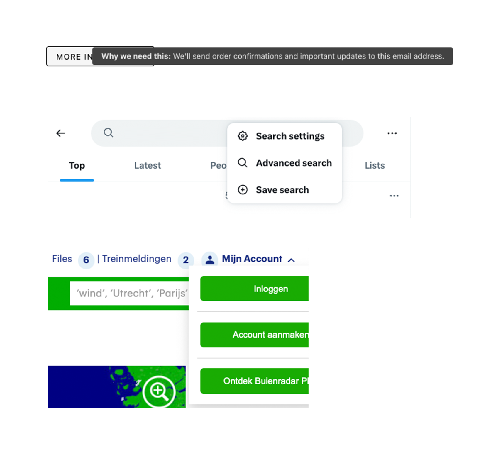
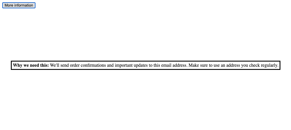
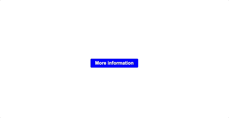
<button id="popover-trigger" popovertarget="popover">More information</button>

<div id="popover" popover>
    Why we need this: We'll send order confirmations and important updates to this email address. Make sure to use an address you check regularly.
</div>
This snippet creates a simple tooltip that displays additional information when triggered. It will work out of the box, although the styling leaves something to be desired.
Positioning Tooltips with CSS
One of the challenges with tooltips is positioning them relative to their trigger element. This calculation involves considering several factors, such as:
- On which side of the trigger should the tooltip be rendered?
- Where is the centre of the tooltip relative to the centre of the trigger?
- Is there enough room to render the tooltip?
Implementing this in JavaScript can result in a large amount of code. However, with the Popover API and new CSS features, we can achieve the same effect with much less code:
#popover-trigger {
  anchor-name: --popover-trigger;
}

#popover {
  position: absolute;
  max-width: 250px;
  min-width: 200px;
  position-anchor: --popover-trigger;
  inset-area: right;
}
const popover = document.querySelector("[popover]");
const trigger = document.querySelector("[popovertarget]");
trigger.addEventListener("mouseenter", (event) => {
popover.showPopover();
});
trigger.addEventListener("mouseleave", (event) => {
popover.hidePopover();
});Handling Viewport Overflow
To ensure the tooltip behaves correctly when it doesn't fit within the viewport, we can use a combination of the position-try rule and the @position-try at-rule:
#popover {
  ...
  --margin: 8px;
  max-width: 250px;
  min-width: 200px;
  margin: var(--margin);
  position-anchor: --popover-trigger;
  inset-area: right;
  position-try-options: --bottom;
}

@position-try --bottom {
  margin: var(--margin);
  inset-area: bottom;
}
Here's what each property does:
position-anchor: --popover-trigger;: Anchors the tooltip to the triggering element using a custom anchor point.inset-area: right;: Initially positions the tooltip to the right of the trigger element.position-try-options: --bottom;: Tells the browser to try an alternative position if the tooltip would overflow the viewport.@position-try --bottom { ... }: Defines what should happen when the tooltip needs to be repositioned, moving it to the bottom of the trigger element with the same margin.
With some additional styling, the result looks like this:
Final result:
Conclusion
The Popover API and new CSS features greatly simplify the process of creating and managing tooltips and popovers. It handles the complexities of managing popovers, ensuring they are accessible and properly positioned. The new CSS features, like anchor and @position-fallback, provide additional customisation options for fine-tuning the placement and behaviour of popovers.
However, it's important to check the browser support for these features, especially the CSS properties, as they may not be supported in all browsers yet. Please check MDN for the latest information and consider using progressive enhancement techniques when necessary.
Overall, the Popover API and related CSS features are valuable tools for creating user-friendly and accessible tooltips and popovers. As browser support improves, we can expect to see more widespread adoption of these features. Personally, I’m excited to start using this and finally leave behind all those npm packages and custom workarounds!