PWA Patterns on voorhoede.nl
Progressive Web Apps - or PWAs for short - are a successful marketing buzz word. But the real beauty is that a PWA is just an upgrade of your existing site with native-like functionality. And that's exactly what we did to make our site feel more like a real app.
Start as a website
You can use a cutting edge JavaScript framework for your new greenfield Web App and add all the latest browser technologies. But then you're neglecting the P in PWA, which stands for Progressive. Progressive enhancement is the art of gradually improving the user experience while first checking if the browser is capable of it. You start with content and ensure you maintain functionality and accessibility for everyone as you add new technologies.

Lucky for us, we already have a website. It works in the latest Chrome, in legacy browsers, on an e-reader, and is accessible to screen readers, search engines and other user agents. Each page is discoverable, accessible and shareable through its own URL. Chances are you got to this page by following a link from another web page or social medium. Yay, web!!
Make it installable
On Android PWAs are treated as first class citizens: PWAs are installable, get a place on the homescreen, in the app drawer and you can manage them like native apps via the app & notifications settings. While different browsers have different requirements for this behaviour it mostly comes down to your site needs to be served over HTTPS, have a Service Worker, a manifest and an app icon. HTTPS is a no-brainer, not just for your users’ privacy and security, but also because most modern browser features require it. We'll dive into Service Workers, but for now registering an empty sw.js file will do:
if ('serviceWorker' in navigator) {
  navigator.serviceWorker.register('/sw.js')
}
The key to making your site an installable app is adding a manifest:
<link rel="manifest" href="/manifest.json">Inside manifest.json we describe our app:
{
  "short_name": "De Voorhoede",
  "name": "De Voorhoede \n Front-end Developers",
  "start_url": "/?homescreen=true",
  "display": "standalone",
  "orientation": "portrait",
  "theme_color": "#12353C",
  "background_color": "#E7D81D",
  "icons": [{
      "src": "/logo-1024x1024.png",
      "sizes": "1024x1024",
      "type": "image/png"
  }]
}
This results in the browser prompting to install our site as app. If the user accepts, we get an icon on the user's homescreen. This uses the short_name and one of the icons we defined. Clicking the icon opens the app in standalone display mode. At first we get a splash screen using another icon, the background_color and this time the full name. Once the start_url is loaded, the app transitions to our homepage:
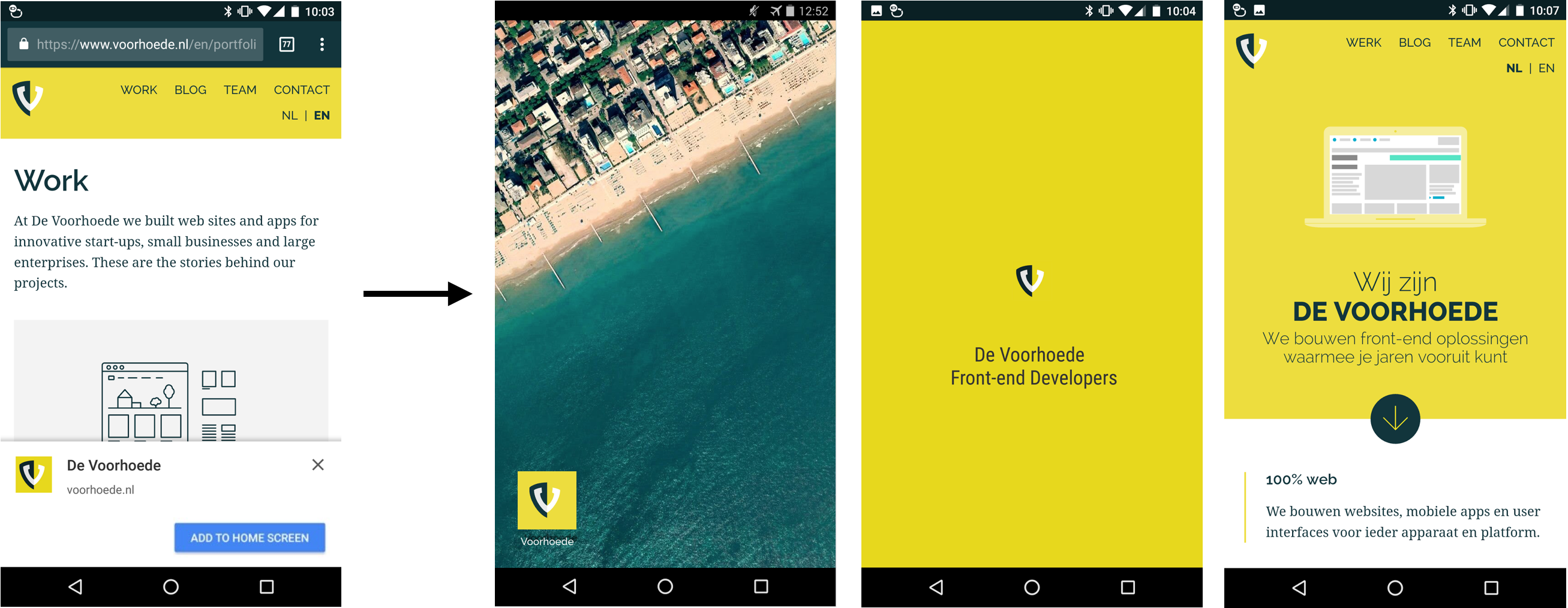
Voorhoede.nl is installable on Android and opens standalone when opened from the homescreen.
Ironically, we spend a lot of time on making our site as fast as possible. But now instead of showing meaningful content as soon as possible, we have a splash screen. And those amazing URLs I was talking about, we just lost those too. So clearly becoming more app-y comes with trade-offs. And understandably people voice their concerns, like in Jeremy Keith's Regressive Web Apps. For some projects these new patterns make more sense than for others. Our motivation for our site is mainly to demonstrate and experiment with PWA features. Most importantly, the power is still with the user, who can just visit your site or opt-in to install it as an app.
Celebrate network independence
With that Service Worker we just registered, we get access to all requests before they hit the network. And that's no small feat. Ever since the beginning of the web we've been dependent on network conditions and the ability to reach our server. If the network was flakey or our server was down our users would get stranded. But with the Service Worker we get to decide how requests are handled and what response the browser receives. For our website we use a cache first strategy. If you navigate to a page, within our Service Worker script, we first try to find a response for the request in the cache. Only if there is no response do we go to the network to fetch the resource. To make sure we do have it in cache the next time, we store a copy of the response in the cache. It goes something like this:
// sw.js
self.addEventListener('fetch', event => {
  event.respondWith(cacheFirst(event.request))
})

function cacheFirst(request) {
  const cacheName = getCacheName(request.url)
  return caches.open(cacheName)
    .then(cache => cache.match(request.url))
    .then(response => {
      return response || fetchAndCache(request, cacheName)
    })
}

function fetchAndCache(request, cacheName) {
  return fetch(request).then(response => {
    const copy = response.clone()
    caches.open(cacheName)
      .then(cache => cache.put(request, copy))
    return response
  })
}
There are key assets like our main styles and scripts which we always need. To become truly independent of the network we pre-cache these files on install. And as a bonus we pre-cache our offline fallback pages, so our website even works when we have no access to the network or our server at all. We could have cached our entire site on your first visit, but we don’t to waste your data bundle, so we stick with the key assets:
// sw.js
self.addEventListener('install', event => {
  event.waitUntil(
    caches.open('core-v1')
      .then(cache => cache.addAll([
        '/assets/css/main-e837985c83.css',
        '/assets/js/index-f82f705180.js',
        '/en/offline/',
        '/nl/offline/',
      ]))
      .then(() => self.skipWaiting())
  )
})
If you've paid close attention you may have noticed I left out the part how we serve these core assets and offline fallback pages. Declan wrote a much better and lengthier article on our Service Worker caching strategy. You can also peruse our actual [sw.js](/sw.js) script if you want all the nitty gritty implementation details. If you're just here for the end result, here it is:
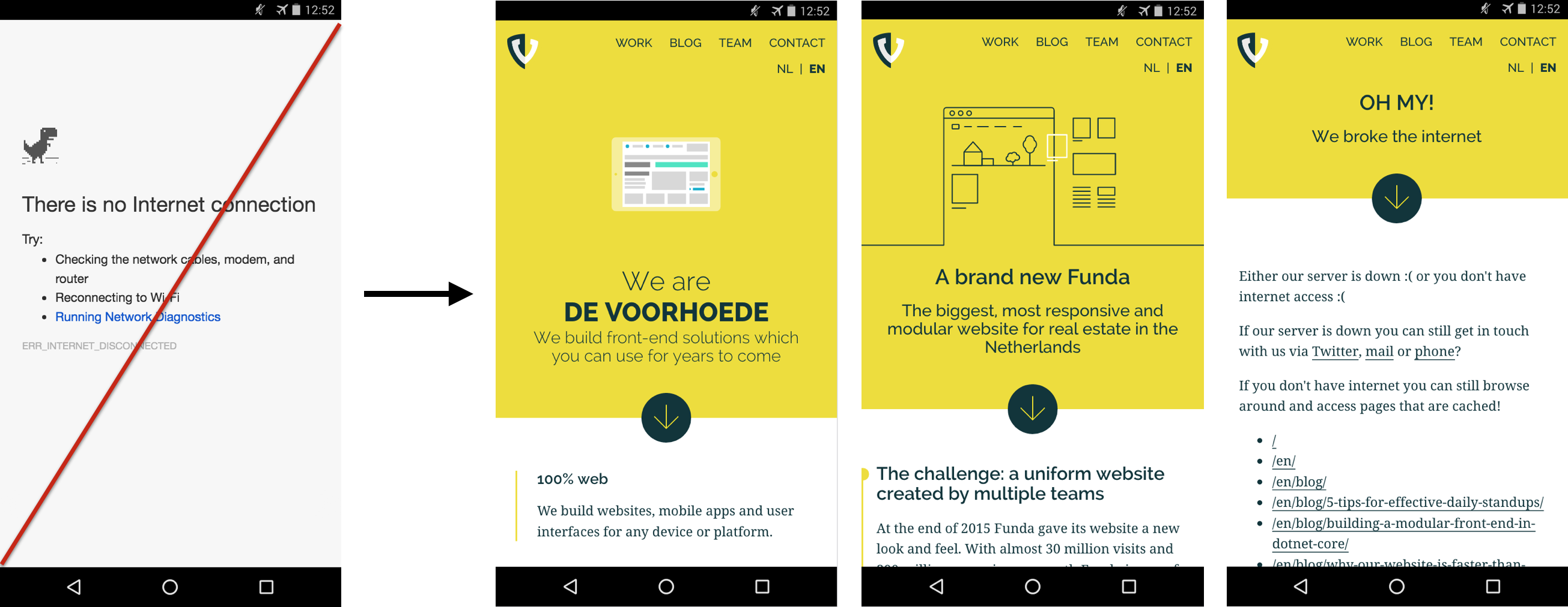
Pages visited earlier are always available. When offline and a page is not cached, you get a fallback page.
Offline as a feature
With our new Service Worker caching strategy, our site has become more reliable, loads faster and pages visited before are even available offline. But users probably don't yet expect this of a website. To inform our users, and yes to show off a bit, we highlight when content is available offline:
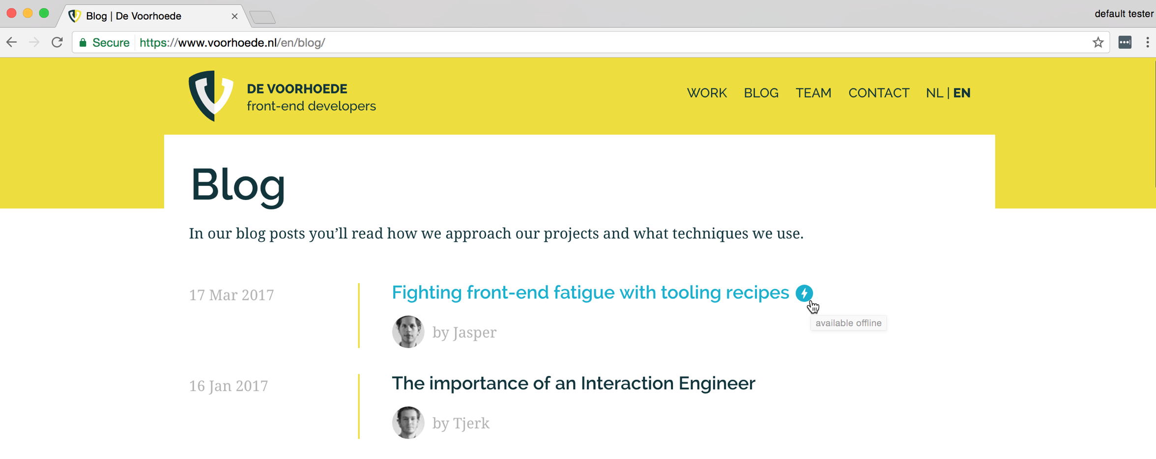
Lightning bolt icons with "available offline" tooltips are displayed next to cached content.
This pattern is especially useful when you want to reassure users things are always available and their data is not lost no matter what. In the future, this may become expected behaviour and at that time we'll clean up our interface.
Keep content fresh
Most of our content, like this blog post, hardly ever changes. This means after you read this blog post, the Service Worker could serve it from cache for a long time. That's fast and efficient. But this page is more than just content. There's an overall layout and we include style and script files. If those change, the page also changes and the cache needs to be updated or at least invalidated. That feels inefficient. The cause of this issue is that our site is a static site, rendered server-side, rather than a single page app with an app shell separate from its content. We solve this issue by moving a fraction of the rendering to the Service Worker. Our CSS and JS files change most frequently. Every time their content changes, their filenames change to invalidate their cache. The Service Worker updates their references in the HTML after grabbing it from the cache and before it's sent as a response:
// sw.js
function alterHtmlResponse(response) {
  return response.text()
    .then(html => renderTemplate(html))
    .then(body => replaceResponseBody(response, body))
}

function renderTemplate(template) {
  return template
    .replace(/href="[^"]*\/main-[a-z0-9]{10}\.css"/g, '/assets/css/main-e837985c83.css')
    .replace(/src="[^"]*\/index-[a-z0-9]{10}\.js"/g, '/assets/js/index-f82f705180.js')
}

function replaceResponseBody(response, body) {
    return new Response(body, {
        status: response.status,
        statusText: response.statusText,
        headers: {'content-type': 'text/html'}
    })
}
Jeff Posnick does a great job explaining this Service Worker templating in more detail.
Now pages look fresh, even when the layout changes. But what if the content of a page does change? Our home page shows an upcoming event. When that event has passed the next event should be displayed. If you've been on our home page before, our cache first strategy means you will just get the old page. It's fast, but it's no longer fresh. To fix this, the Service Worker checks which content is outdated and informs all connected browser windows (clients) using postMessage:
//sw.js
self.addEventListener('activate', event => {
  event.waitUntil(caches.keys().then(cacheNames => {
    const outdatedCaches = [ /* ... filters `cacheNames` */ ]
    broadcastOutdatedCaches(outdatedCaches)
      .then(() => deleteCaches(outdatedCaches))
      .then(() => self.clients.claim())
  }))
})

function broadcastOutdatedCaches (cacheNames) {
  return broadcastToClients({
    type: 'outdated',
    urls: [ /* ... uses `cacheNames` */ ]
  })
}

function broadcastToClients (message) {
  return self.clients.matchAll()
    .then(clientList => Promise.all(
      clientList.map(client => client.postMessage(message))
    ))
}
Within our pages we listen to the message event. If the current page you are looking at is among the outdated pages, we first fetch a fresh copy and then inform you with an in-page notification:
// index.js
if('serviceWorker' in navigator) {
  navigator.serviceWorker.addEventListener('message', event => {
    const { type, urls } = event.data
    const includesCurrentPage = urls.includes(window.location.href)
    const currentPageIsOutdated = (type === 'outdated' && includesCurrentPage)
    if (currentPageIsOutdated) {
      fetchNewPage().then(showMessage)
    }
  })
}
This is the result:
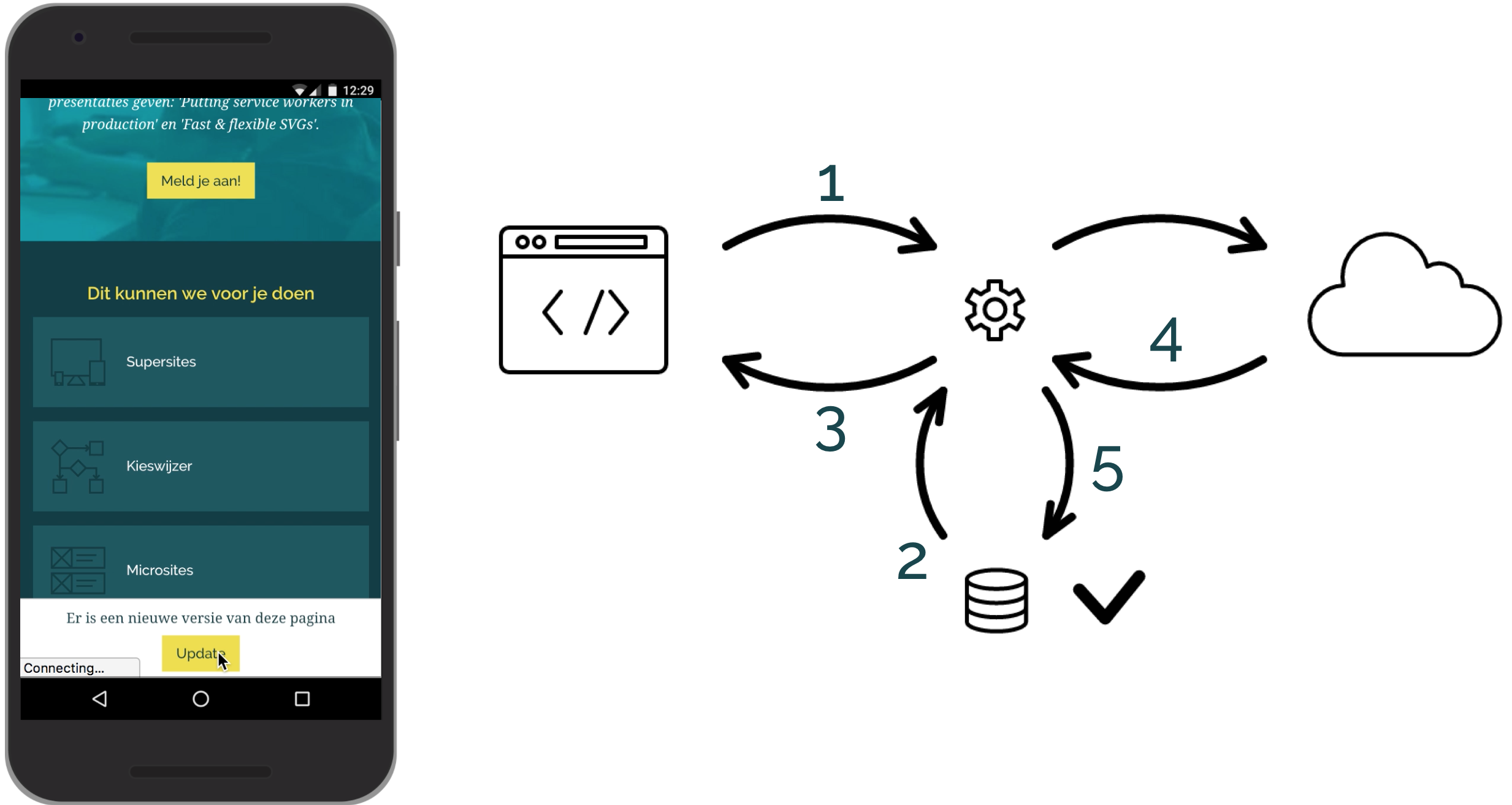
In-page notification lets user update to newest content.
This pattern is called "stale while revalidate". You're looking at old content (without knowing it) until we've verified if newer content is available. We could have showed the notification with "A newer version of this page is available" the moment we found out the content was outdated. However you would have had to wait for the new page to be fetched from the server. That's poor performance. And if you lost network connectivity after we displayed the notification you might end up with no content at all. Not quite the first class app experience we aspire to. So instead we first fetch fresh content, and only after we've cached that do we show the notification.
Add push notifications
Still there? Good! Keeping users on your site is hard. It's even harder to get them to return once in a while. Luckily Progressive Web Apps also promise user re-engagement. A place on your visitor’s mobiele device home screen is a good start. Relevant well-timed push notifications are even better. The Service Worker lets us do that. Like most powerful web features, users have to opt-in to push notifications. If the user allows them, you're good to go. If they block, it's hard to get notifications enabled again. So it's of paramount importance to ask for permission at the right time. We offer users to receive blog updates via push notifications. Only on user intent, when they hit our "Get notifications" button, do we ask the browser to prompt for permission:
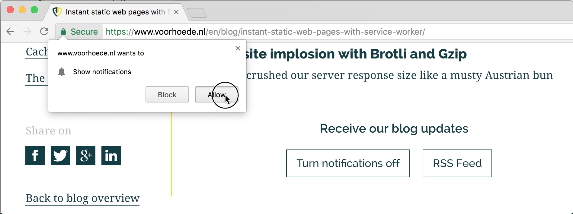
After hitting the 'enable notifications' button in the page, the browser prompts the user.
Under the hood, a lot of things need to happen when a user hits that "Get notifications" button. Has the user already given permission to send push notifications? If not, we need to prompt for permission. If we have permission we need to get that subscription and send it to a server so it knows where to push to. Oh, and we'd also like this to work on browsers which support notifications but have a different implementation. Long story short, we use OneSignal to do the hard stuff, so we can focus on user experience. This way all we need to do is use the OneSignal API and toggle some buttons:
// index.js
subscribeButton.addEventListener('click', () => {
  subscribeUser()
  hideSubscribeButtons()
  showUnsubscribeButtons()
}, false)

function subscribeUser() {
  OneSignal.push(() => {
    OneSignal.registerForPushNotifications()
    OneSignal.setSubscription(true)
  })
}
There's another reason we picked OneSignal. It comes with a handy dashboard to compose your notifications. We craft our notifications by hand because we only send very few of them and when we do they deserve some attention. Once we hit send you'll receive a push notification either on your desktop or mobile, you don't even have to have your browser open:
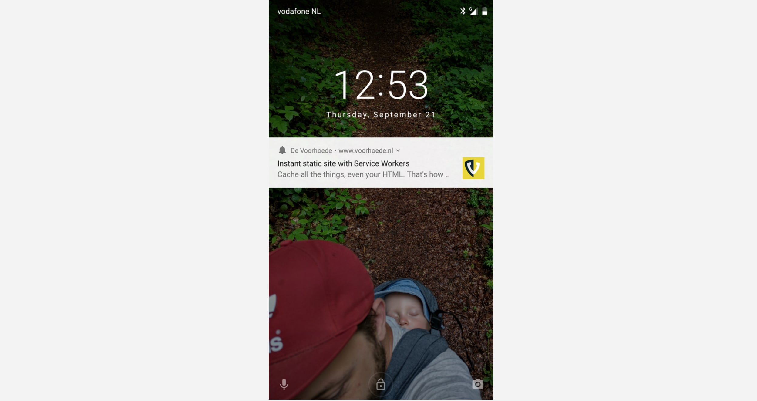
Push notification from voorhoede.nl on Android lock screen.
Just like with the "stale while revalidate" pattern it's good practice to fetch the content with the Service Worker on the push event, before triggering the actual notification. That way, content loads instantly the moment you click that notification. If you're curious how it works, scroll down to the end of this page and subscribe. You'll receive a notification the moment we publish a new blog post.
Share like a native
Remember that URL we took for granted but lost in our standalone PWA? Well, not all is lost. We added static share links to our pages, like on this blog post. This kinda solves our missing address bar issue in standalone mode. If you're on your mobile device with the Twitter app installed and you follow the "share on Twitter" link it will most likely open in that app. But what if you want to share it via Slack or WhatsApp? We don't know which other apps you have installed (and that's a good thing). Thanks to the brand new Web Share API we don't have to either as we can invoke native share and leave the options up to your device:
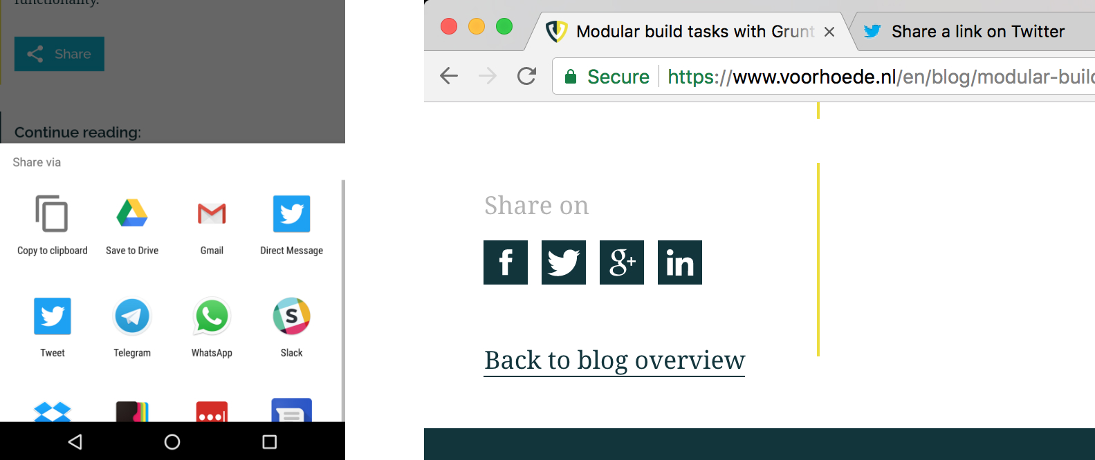
When the Web Share API is enabled we provide a single integrated share button. In all other browsers we show share icons for popular social media.
We make sure to put the Progressive in Progressive Web Apps. We start out with plain links to popular social media with a text and URL of the page prefilled. Only after we've checked your browser supports the new Web Share API, do we replace these links with a single share button. We reuse the share parameters from the static links. And when you hit that share button we call the Share API:
if ('share' in navigator) {
  const { title, url } = getShareParams()
  const button = showShareButton()
  button.addEventListener('click', () => {
    navigator.share({ title, url })
  })
  hideShareLinks()
}
Do you get the "native share" button? Do you like how it works? I'm happy to discuss this and all other PWA features. You can find me as @jbmoelker on Twitter.
Start now
Not all users can enjoy these new app-like features as their browser may not support them yet. But the required technologies are gaining momentum. Notably Service Workers - the core of Progressive Web Apps - are coming to Edge and Safari. And there are a lot more UI patterns to make your site feel more app-y. So now is a good time to start upgrading your site to a PWA.
