Design systems boost user experience and efficiency. But turning an existing design into a system, can be a challenge. To kick-start this process we’ve developed the Design Inventory Workshop.
A design system is more than sharing the same typography, color swatches and visual components. A good system gives a team a shared understanding, vocabulary and rules around a design. The design inventory workshop helps digital teams create this shared system. The starting point can range from a design mockup of a single site to a collection of existing digital products.
Design System Inventory in 5 steps
Our steps for the inventory are always the same:
- Gather all designs
- Extract all components
- Define component rules
- Define interaction & data points
- Define page types

1. Gather all designs
To get started we want to give the entire team a shared overview of the design:
- Put prints of all the designs on the wall. We prefer an in-person workshop, but if you want to save some trees or rather do a remote workshop you can also import all designs to an online board (like Miro or Mural). This step takes some time, so you may want to prepare this before the workshop.
- Name all the pages. To communicate about your design system, it’s essential for the team to talk about the same thing. So give each design / page / app view a name like “product page”.
- Give each page a URL (pattern). For example “/nl/shop/39042-product-name”. For new products this adds structure. For existing products it makes it easier to find back parts that you used during this workshop. ## 2. Extract all components
2. Extract all components
Next up, we want to break the designs up into components:
- Cut prints / crop images. You may want to print everything twice so you can have one on the wall and cut on into components. If we’re doing a quick version of the workshop we just draw outlines on the prints on the wall.
- Group same/similar components. This helps get an understanding of all the variations a component can have, both intended and unintended. Part of this process is deciding if things are variations of the same component or actually two distinct components.
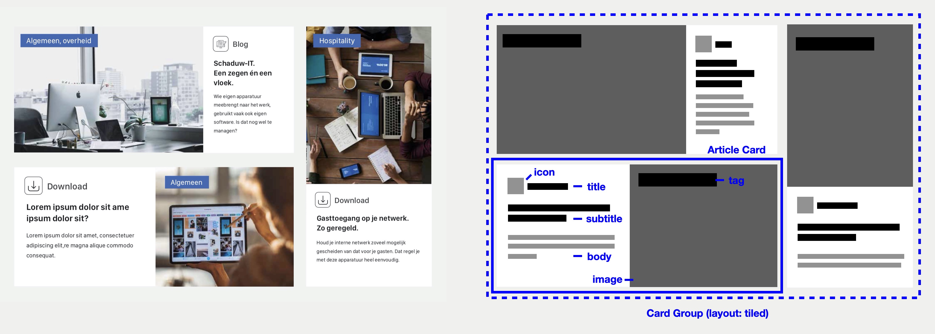
- Name each component. For example “app header”, “user menu”, “page section”. Try to be consistent and as specific as needed. Do we call these things “cards” or “tiles”? And is “card” specific enough or do we have a separate “product card” and “article card”?
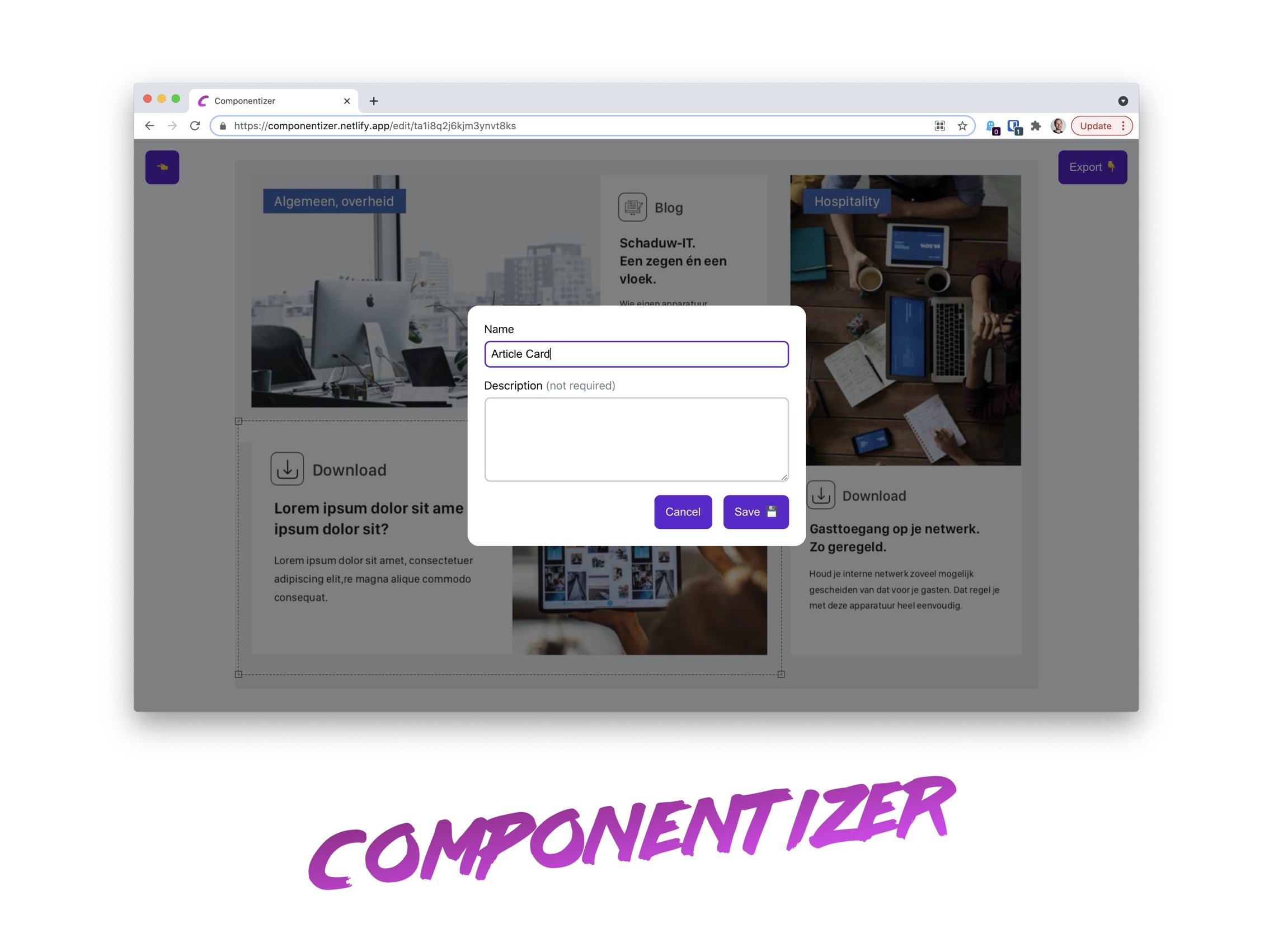
Our colleague Sjoerd made Componentizer, an online tool to quickly extract and name components. It’s easy to use, so you should give it a try.

3. Define component rules
It’s time to put the system in the design system and define rules for our components:
- Name the parts of each component. Like “title”, “image”, “body”. Again try to be consistent. Developers can neatly use these part names in CSS strategies like BEM, where these translate to
product-card__title,product-card__imageetc. - Add rules for when to use a variation of a component and remove unwanted variations. For example the title of the first product card on the page should always be highlighted. The variation can be translated to code like
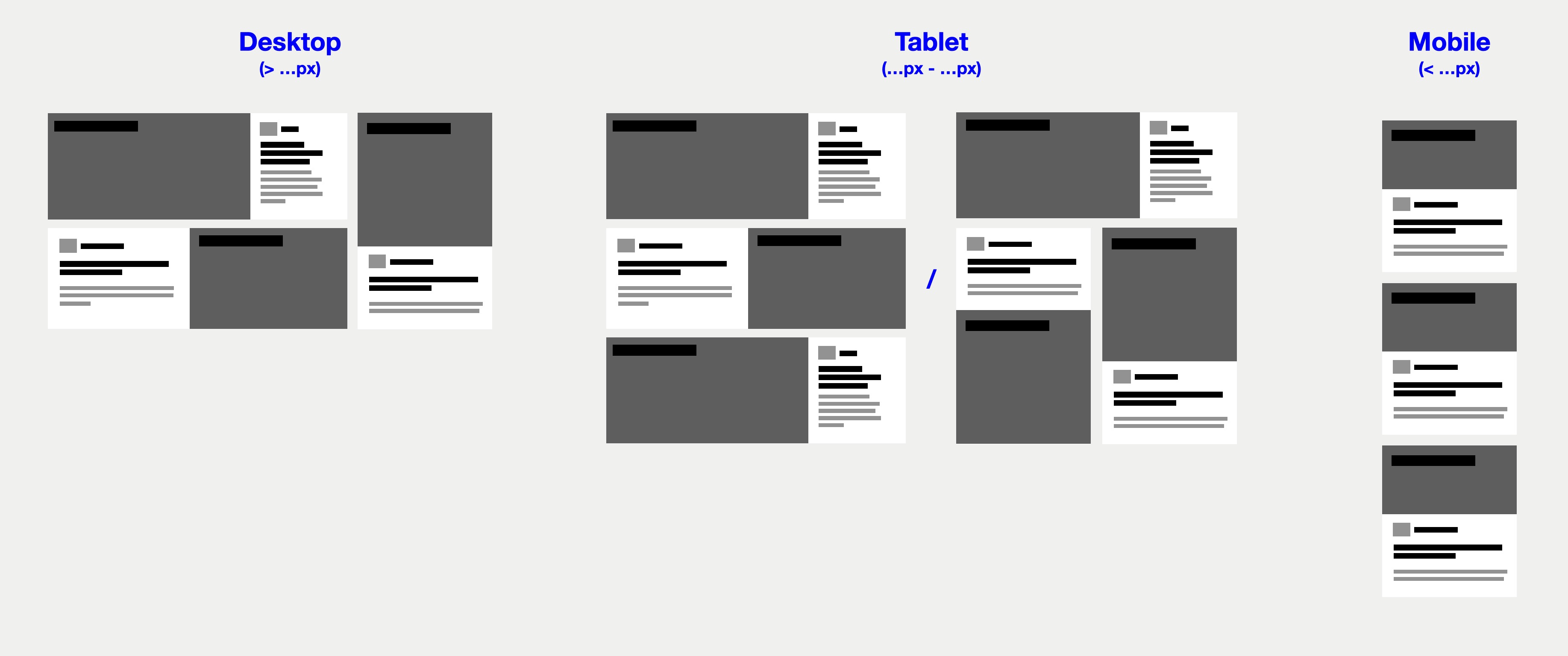
product-card__title--highlight, but the rules about when to use the variation should go in a place where the whole team has access to it. - Define responsive behaviour. How does a component change over different breakpoints? Does it depend on the size of the viewport or the size of the parent component? And does that mean the behaviour depends on the much request CSS container queries or do you maybe need an additional component like a “card group” responsible for the layout of multiple components?
- Annotate animations and triggers. Animations are easily overlooked when working on static exports of the design. If components contain animations annotate them and describe what triggers them. If your animations are defined in a tool like ProtoPie, link to them. Just like with the responsive behaviour you may find your component needs a parent component or context to bind animations to what triggers them.

4. Define interaction & data points
The final piece of the puzzle is understanding how our components really work when users interact with them and finding out where components get their data from.
- Mark all interactive elements. Annotate how they are controlled and verify that the they are accessible. For example if a card can be expanded, is it clear for everyone or is this only indicated with a hover effect and only possible by clicking or tapping on it? In that case, add a todo to make the interaction possible with a keyboard and ensure element focus is managed properly. This step should help make your design system accessible from everyone.
- Annotate data points. The last thing controlling our components is the data that flows through them. Define where data is coming from and in what format. This will help figure out if a component is responsible for both getting its own data and showing it, or whether you need to split this into a presentational component and functional component responsible for the data.

5. Define page types
Now that we have a deep understanding of our components, it’s time to validate we can compose entire pages with them.
- Group same/similar pages. This is especially useful when you have multiple digital products and want to use your design system to make them more uniform.
- Draw a layout per page using components. This way you have a critical look at every page type and find if there are missing components or hopefully that you can remove or replace components. You should start to experience the efficiency the design system can bring.
When you want to do all steps of the inventory for all components it can take quite a bit of time. So depending on the size of a project and the time available we run different versions of the workshop. We might skip steps or only do a few components with the entire team, do the rest individually and present them to the team in a follow-up session. I hope you find this approach useful and it helps kick-starting your design system.
Book a Design System Workshop
Would you like some help to kick-start your design system? Book a Design System Inventory Workshop at De Voorhoede.
Related blog posts
How to select a framework for design system components
By Jasper
Building a Design System with React Web Components
 By Jasper, Sjoerd
Design System Tooling
 By Jasper, Karlijn
