Accessibility and inclusivity still gets too little attention in web development. Mostly for reasons like budget and capacity. Even though it's proven that when you build your website or app accessible, it's more useful for all users.
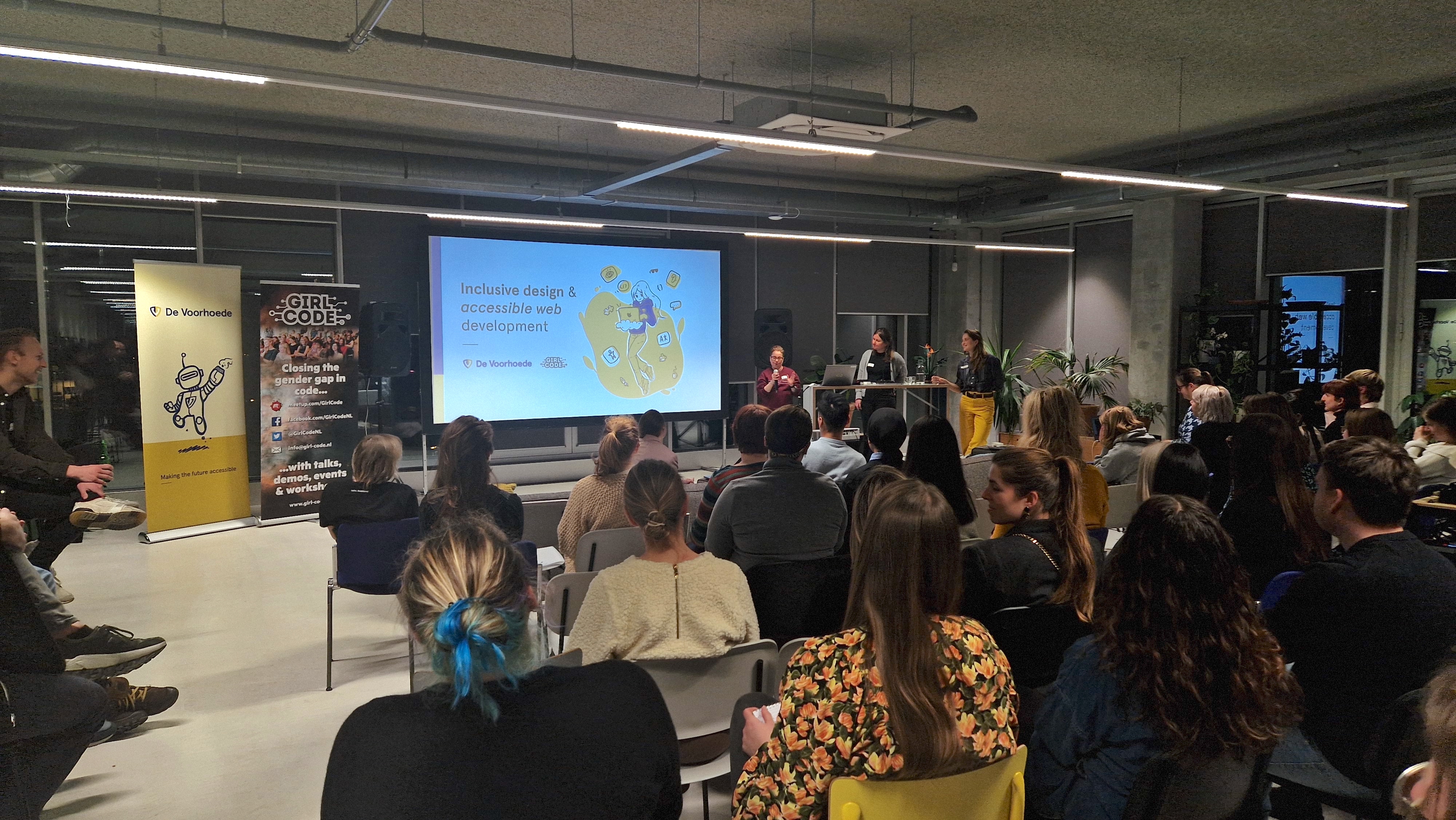
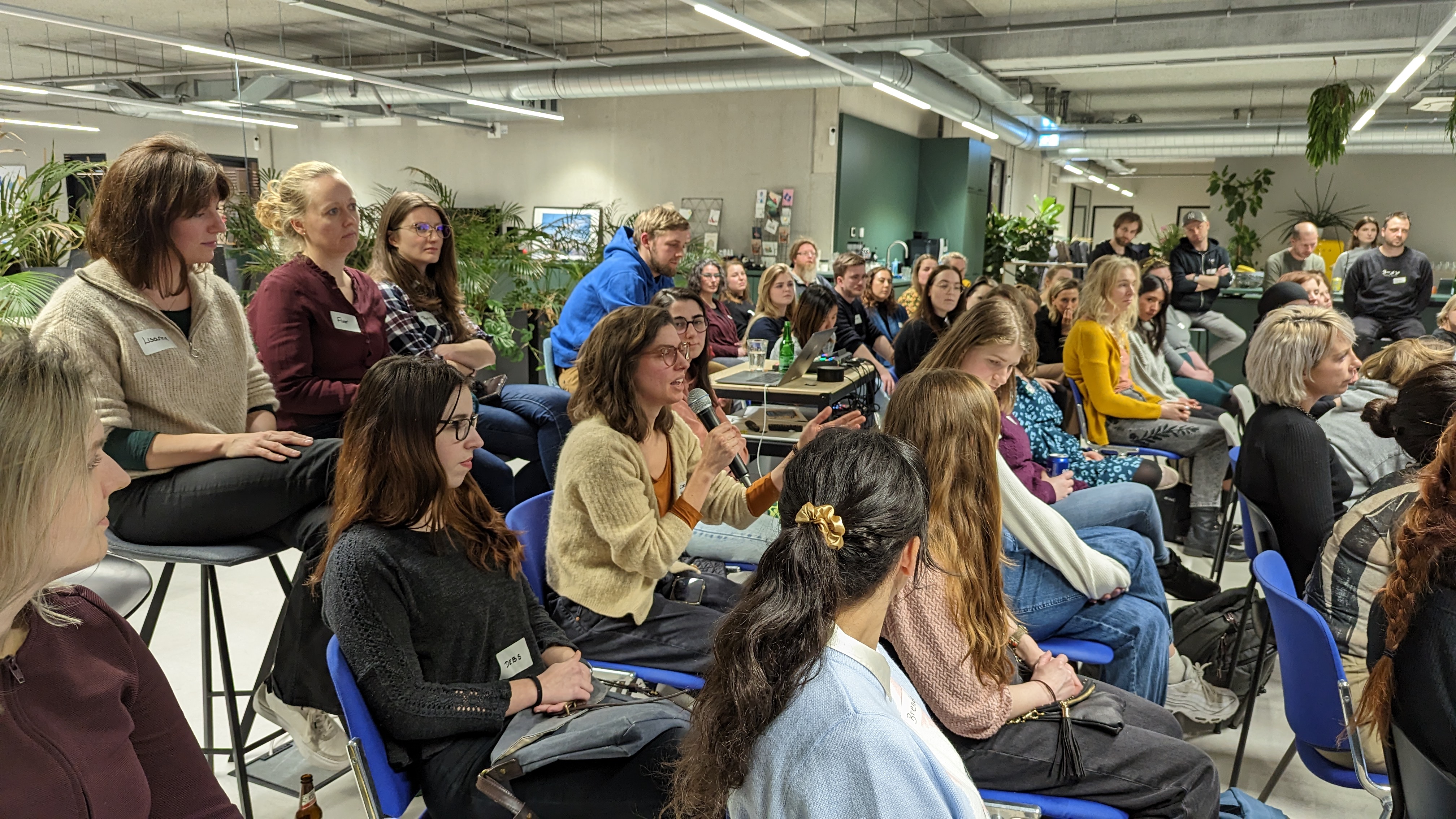
On 16 March 2023 we organised a meetup in collaboration with Girl Code about Inclusive Design and Accessible Web Development. In our office in Amsterdam we enjoyed 3 talks from Darice de Cuba, Cyd Stumpel and our own developer Roos Steigenga. They inspired everybody present to be a little more aware of the need of web accessibility and inclusivity.
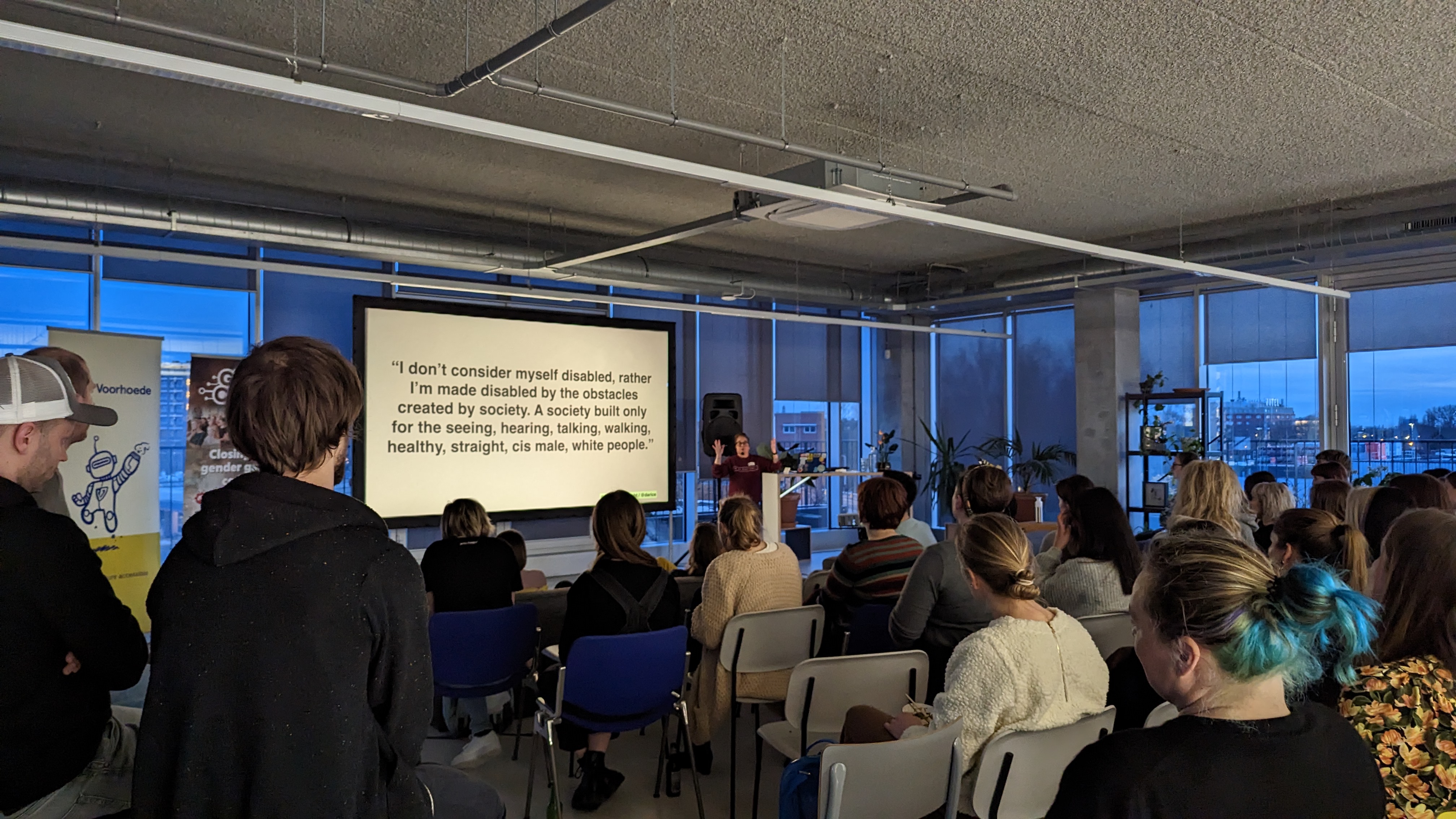
Comment sections and communication preferences
Darice took us through some examples from her life in which she experiences difficulties using ordering apps. Darice lost her hearing later on in her life. She explained how comment sections can be a reason for her to use an app or not. The field can be used to tell your preference for communication. So she doesn’t have to run out on the streets to find the delivery person that keeps calling her. She made a strong case that when you make your website or app more inclusive and accessible, you will get more clients.
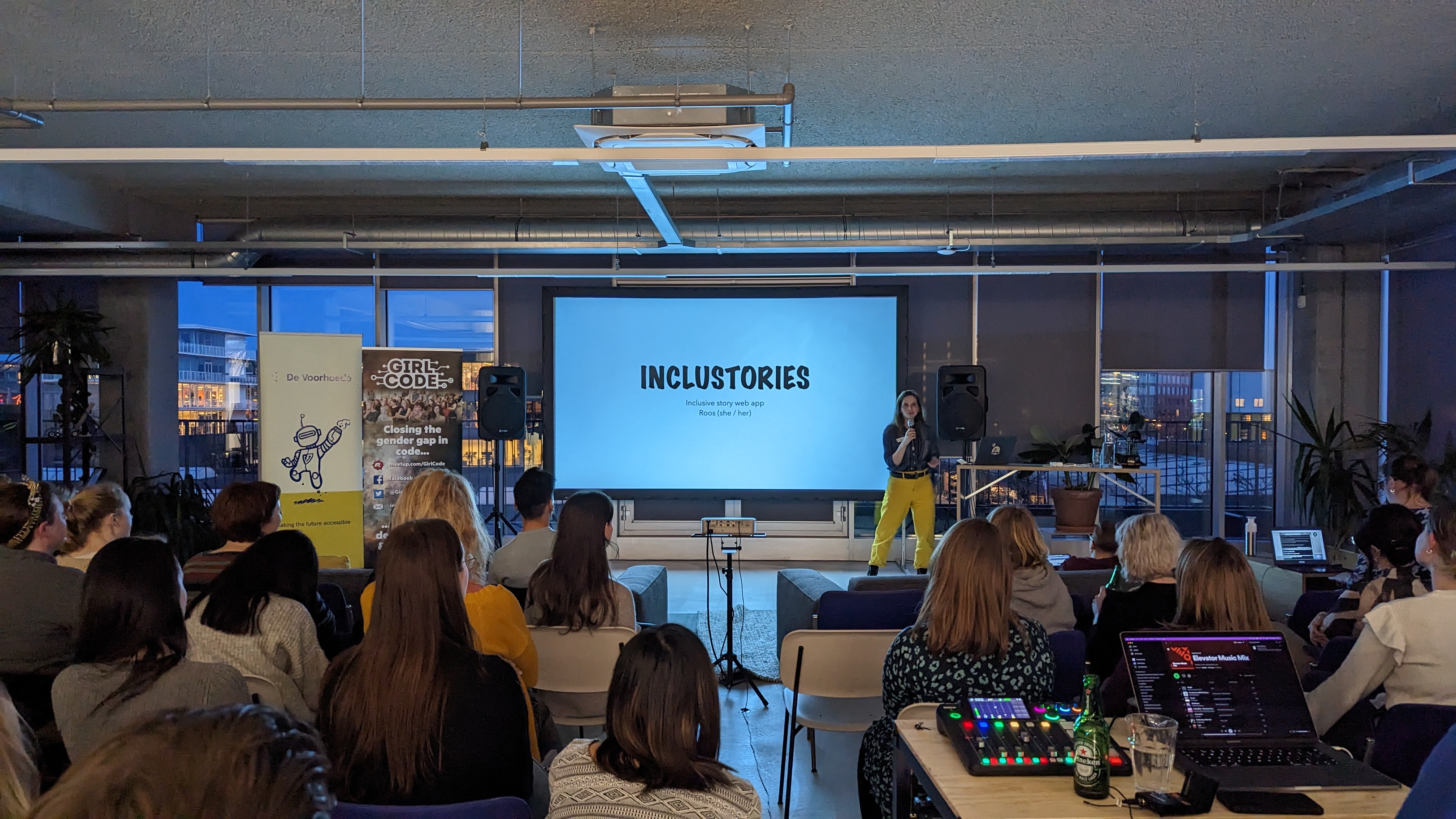
Adjust stories the way you prefer them with Inclustories
Roos pointed out in her talk that stories need to be more inclusive to make people feel like they’re a part of society. She got inspired when she visited the Efteling. The fairytales behind the attractions are full of stereotypes and not very inclusive. Under the motto of ‘be the change you wanna see in this world’ she decided that as a web developer, she could let people adjust those stories the way they prefer them. She created ‘Inclustories’ an inclusive story app using variables in text. Check it out yourself: https://inclustories.vercel.app/
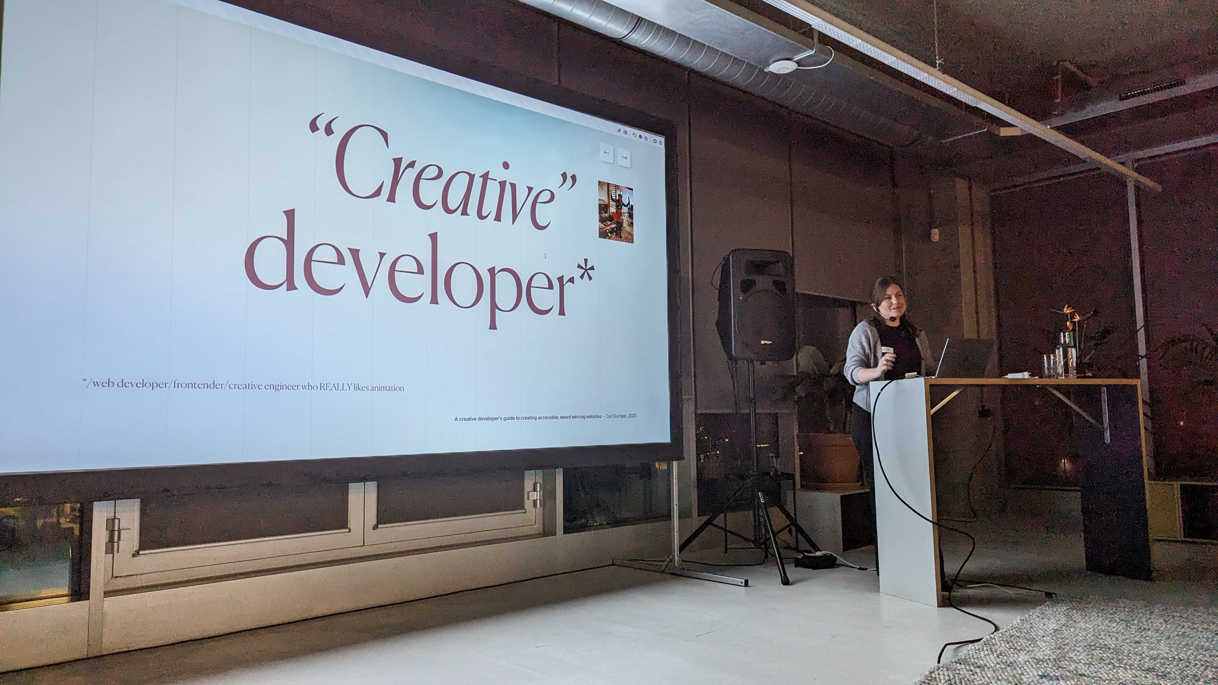
Tips for accessibility in creative development
Cyd wrapped up the evening with a presentation about the state of, or even lack of accessibility in creative development. She noticed that when projects are winning awards, that doesn't mean the accessibility of the site is up to par.
She shared some common mistakes made in creative development:
- Removing ability to select text
- Removing focus styles with no replacement
- Removing native scrolling functionality
- Omitting alternative text in buttons/images/etc.
- Not adding a text alternative to letter animations
- Not respecting prefers-reduced-motion
And some tips on how to do better:
- Rethink your defaults, your resets, your go-to code snippets
- Add text alternatives to letter/word/line animations
- Consider native functionality in virtual scrolling libraries
- Respect user settings with animations
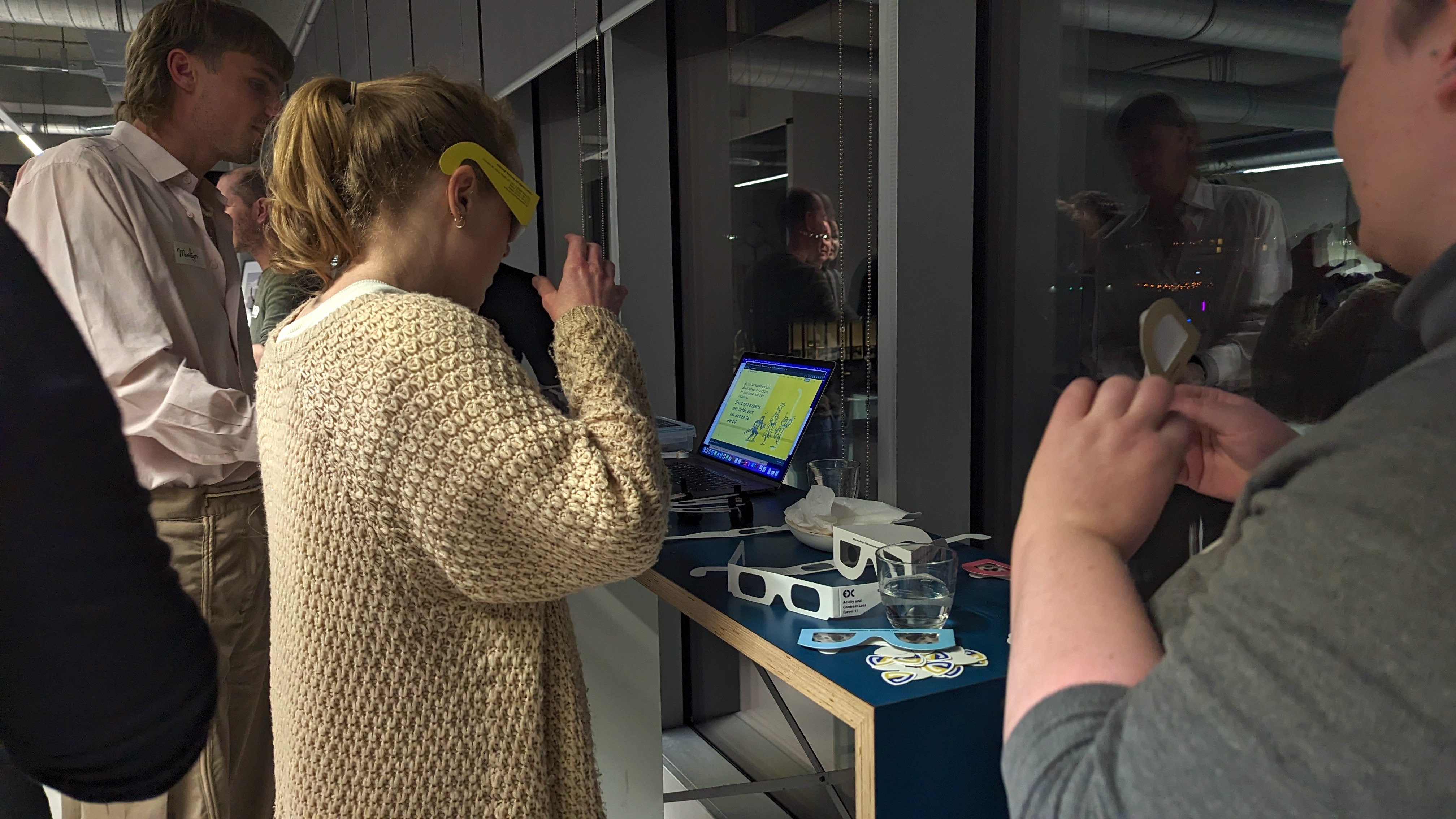
Experience the accessibility kit
After the presentations people got a chance to experience our accessibility kit. Using the simulation gloves while holding a phone or using a keyboard. Looking at a screen through low vision glasses or simulation glasses. We had also set up a laptop with different accessibility personas. All part of our accessibility kit for web developers.
Join our meetup groups
Do you want to be there next time we organise a meetup? Join our meetup groups:
