A Design System is an investment. Depending on your needs and budget, you may prefer a fully tailor-made design system from scratch, or rather a white label from the shelf that you only need to customise to your liking. Off the shelf there’s a whole range of UI component libraries available. How do you decide what to use for your design system?
Yes, there’s much more to a design system than the UI components, like adoption, way of working and governance. We love to write and share about those as well. In this post I’ll focus on just the technical aspects involved in developing design system components and how an off the shelf library can help.
Off the shelf benefits
Why would you use an off the shelf UI component library? Some, maybe obvious, advantages:
- Ready-to-use components. Other designers and developers have spent hundreds, maybe even thousands of hours of work on them. You can often use them for free, saving you a lot of time and money.
- Battle tested and typically with great test coverage. Saving the consumers of your design system from teething problems, which in turn improves adoption.
- Well documented. Improving the affordance of your design system.
- Big Community. With lots of other people that have written tutorials, answered questions, filed and solved issues for you.
- Maintained by others. So you don’t have to.
Downsides the shelf
- Design may not match. The predefined look of an off the shelf component library may be its biggest limitation. There might be a way around this, using unstyled components. More on that later.
- No control over the direction of the off the shelf component library. While it may meet your criteria now, that may change in the future.
- Missing or different rationale from your own design system. How things are approached might not always click with how your team operates.
- Naming and API’s may not match your own design system. Since you have no control over the vendor library, you’ll need to modify your naming and API’s. Or create wrapper abstractions around the library components.
- Built for cases you might not need to cover. This creates unneeded bloat.
- Uncertainty about maintenance. The people or organisation behind the library may change their priority or completely drop the library. Of course you can always fork the library or use it as vendor code if the licence allows it (shoutout to shadcn/ui that uses this strategy by design).
- Restrictive licence. This might limit you in how you can (commercially) use the library now and in the future. So it’s wise to study this carefully beforehand.
Styled vs Unstyled (aka Headless) components
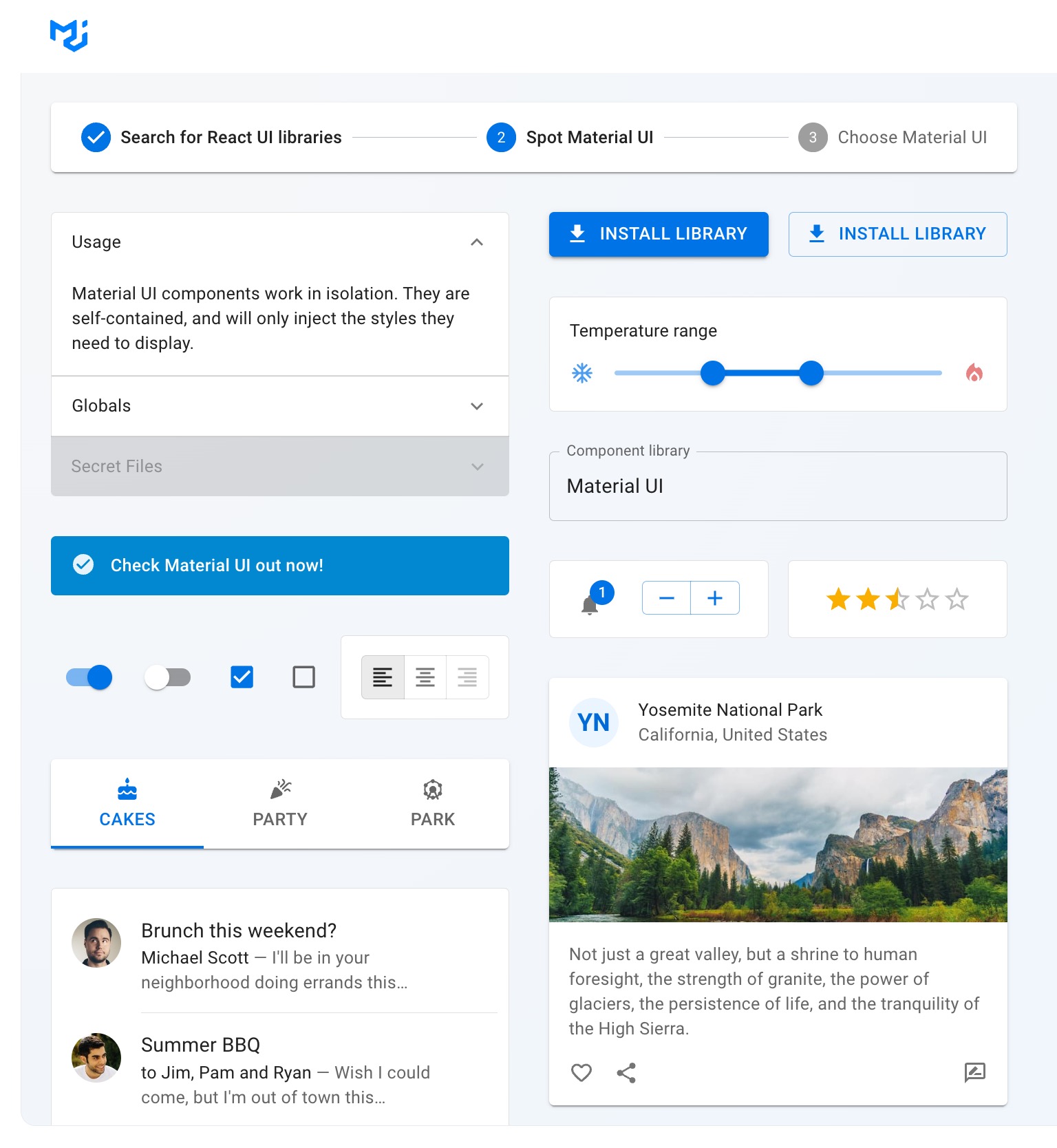
When you think of component libraries you might think of Google’s Material UI in a specific framework flavour, like Angular or React. These are examples of styled component libraries that include CSS, maybe some theming options, and are directly ready to be used.
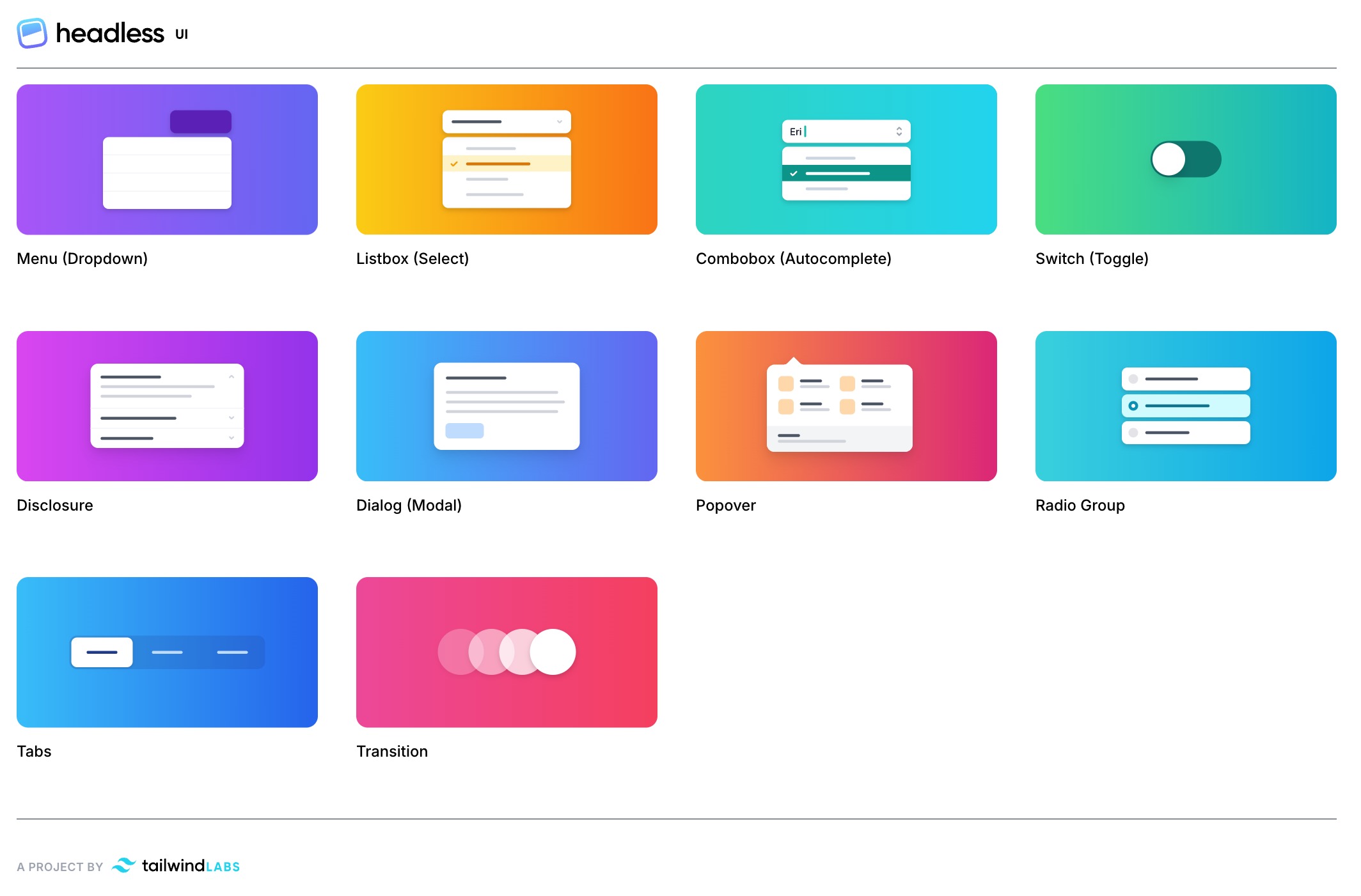
A new category of libraries is gaining popularity: unstyled, also known as headless, components. These components offer functionality, like a tabbed interface or an autocomplete input, but don’t provide or apply any styling. Unstyled components give you more flexibility, and with it more responsibility.
We typically use styled component libraries for quick prototyping and projects with minimal design requirements. For example in a small business-to-business application. In most cases we develop fully custom design systems or use (part of) an unstyled component library.
Off the shelf component libraries
When you decide to use an existing UI component library, how do you decide which one to pick? We believe a good first step is to pre-select two or three candidates based on either ‘styled’ or ‘unstyled’ and the framework(s) you’re using for development. There’s quite a few options to choose from. Below is an inventory of a dozen popular component libraries available off the shelf:
|
Library |
Styled |
Unstyled |
React |
Vue |
Svelte |
Lit |
Stencil |
Vanilla WC |
|
✅ |
Unstyled / base *new |
✅ |
||||||
|
✅ |
✅ |
|||||||
|
✅ |
✅ mode |
✅ |
||||||
|
✅ |
✅ |
✅ |
* unofficial |
|||||
|
✅ |
✅ |
✅ port |
||||||
|
✅ |
✅ |
|||||||
|
✅ |
✅ |
✅ |
✅ |
|||||
|
✅ |
✅ |
|||||||
|
✅ |
✅ |
|||||||
|
✅ |
✅ |
|||||||
|
✅ |
✅ |
|||||||
|
✅ |
✅ |
|||||||
|
✅ |
✅ |
|||||||
|
✅ |
✅ |
|||||||
|
✅ |
✅ |
Other factors to consider
Aside from framework and styling strategy in the matrix, there are other things you may wish to consider, like who’s behind the framework, what’s their philosophy, roadmap and plans for maintenance and support?
‘Unstyle’ styled components
What if you like a styled component library but want to customise it further than it allows? What you could do, is “unstyling” it by not using its CSS and writing your own instead. Since the CSS selectors are not the library’s official (and probably undocumented) API, this can be risky as newer versions may break your implementation. If you decide to take this route it’s probably wise to use the library as vendor code rather than using it as a package.
Refine Off the shelf selection
When you have multiple candidates for UI component libraries, you can make a more fine-grained comparison. A comparison based on features and components helps to figure out how suitable a candidate really is and how much you still need to do yourself, as well as how much budget that would cost.
For example, if we decide that an unstyled React library is what we need, we’d still end up with multiple candidates like Headless UI, Radix, Tanstack, Downshift and maybe others. Here’s a matrix comparing them, stating if they meet our requirements (✅) or how much effort or budget (💶 - 💶💶💶💶) it would take to provide a specific feature:
|
Headless UI v1 |
Headless UI v2 |
Radix |
Tanstack |
Downshift |
|
|
Autocomplete |
✅ |
✅ |
💶 |
💶💶 |
✅ |
|
Button |
💶 |
✅ |
✅ |
💶 |
💶 |
|
Dialog |
✅ |
✅ |
✅ |
💶💶 |
💶💶 |
|
Disclosure |
✅ |
✅ |
✅ |
💶 |
💶 |
|
Dropdown |
✅ |
✅ |
✅ |
💶💶 |
💶💶 |
|
Form |
💶💶💶💶 |
✅ |
✅ |
✅ |
💶💶💶💶 |
|
Table |
💶💶 |
💶💶 |
💶💶 |
✅ |
💶💶 |
As you can see some libraries offer many components, while others offer only a small set of specific ones. Headless UI v2 was recently released and now includes even more components. When you also need those components, the new version reduces your effort even further.
The exercise of comparing component libaries should help us figure out which one is the best match for our needs. Maybe we decide to mix-and-match components from different libraries. That’s typically only an option for unstyled components as we can cover them all with our own style.
Of course up until this point this is all theory. So as a final selection step, we like to create a proof-of-concept for a realistic case to verify that the selected candidate satisfies our needs.
Need help deciding on the right technology for your framework?
Hit us with your questions and let's see how we can help.
Example: Vuetify at Deltares
Our client Deltares is an advanced water research institute. They develop projects with large datasets and water simulation models. These projects often require a user interface to interact with these datasets and models. As the apps are mostly for internal and b2b use, there is limited need for customisation. Additionally, due to the often constrained budgets for each app, they’d benefit from a standardised solution. Together, this makes these apps a good use case for an off the shelf design system. Deltares has a Vue ecosystem, so we opted for Vuetify, the most mature and feature complete styled Vue library.
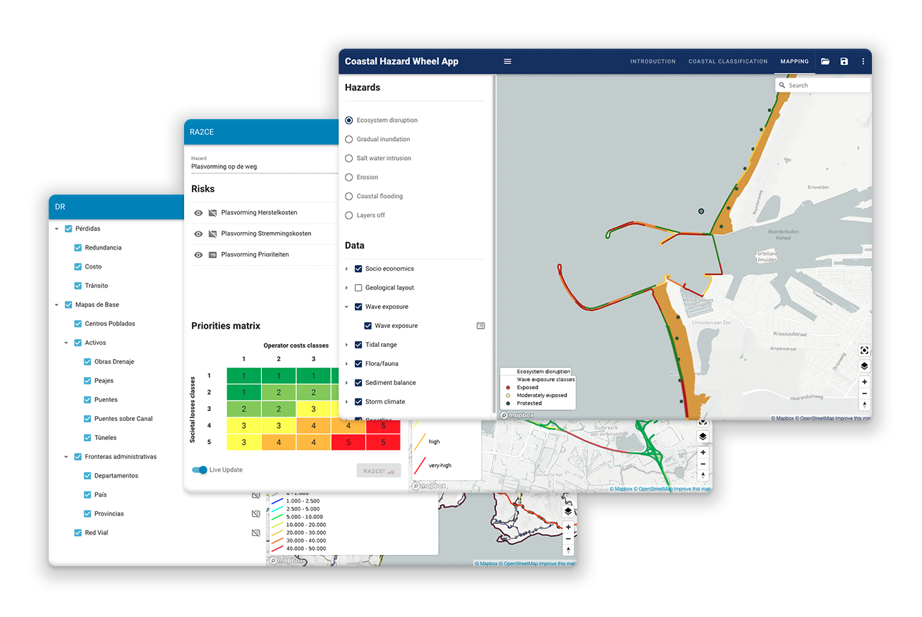
To use a Deltares theme in the Vue apps, we developed a @deltares/design-tokens and @deltares/vuetify-theme package. Using the (light and dark) themes is as easy as passing them to Vuetify:
import Vue from 'vue';
import Vuetify from 'vuetify/lib';
import themes from '@deltares/vuetify-theme';

Vue.use(Vuetify);

export default new Vuetify({
  theme: { themes },
});
What the themes look like:
import tokens from '@deltares/design-tokens';

const { light, dark } = tokens

export default {
  light: {
    primary: light.blue100,
    secondary: light.orange,
    accent: dark.blue60,
    error: light.error,
    info: light.informative,
    success: light.success,
    warning: light.warning,
  },
  dark: { /* ... */ }
}
Vuetify provided a solid foundation with common components such as form elements and dialogs. We could focus our effort on extending this set with Deltares specific components, like a geo viewer layout, chart and map components in a @deltares/vue-components package. If you want to have a closer look, all the Deltares Vue packages are available open source.
Example: Radix, Downshift and Dayzed at PostNL
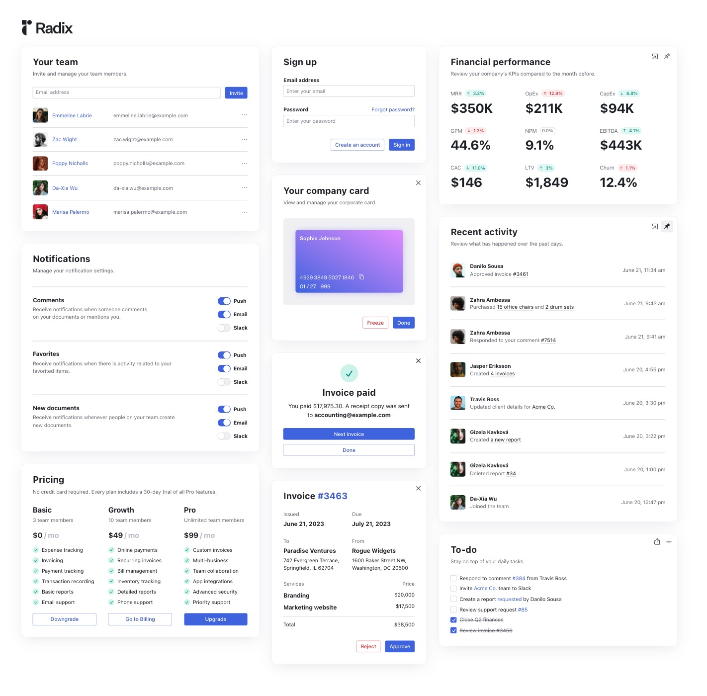
PostNL is the national postal service of the Netherlands. They are an enterprise with dozens of digital products both B2C and B2B. Unlike Deltares, PostNL desires fine-grained control over the look and feel of their products. They set a high bar when it comes to quality and accessibility of their user interface components. PostNL’s tech landscape is diverse, with a significant role for React web apps. To balance their needs, we decided to combine fully custom components with off the shelf unstyled React components. The beauty of these unstyled component libraries is that you can easily mix-and-match them. PostNL benefits from common components like tabs from Radix, combined with specific feature components like the Downshift autocomplete and Dayzed datepicker component.
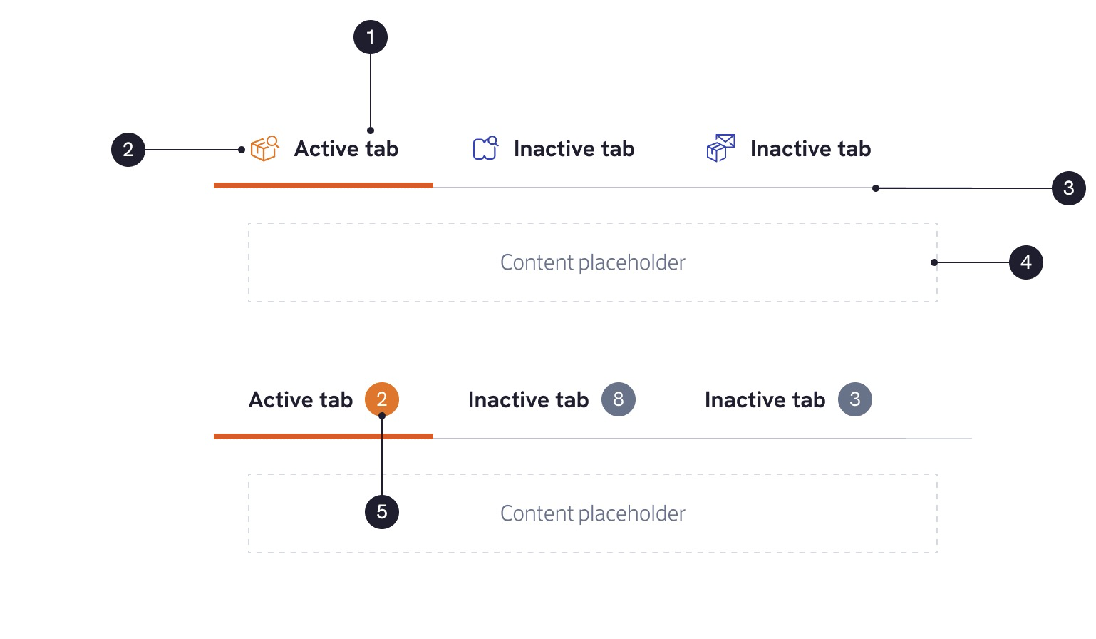
Here’s how the Radix tab components are used within PostNL’s Stamp Design System:
import {
  TabsList as RadixTabsList,
  TabsListProps as RadixTabsListProps,
} from '@radix-ui/react-tabs';

export type TabListProps = RadixTabsListProps;

export const TabList = forwardRef<HTMLDivElement, TabListProps>(
  ({ className, children, ...props }, ref) => {
    return (
      <RadixTabsList
        className={ clsx('stamp-tab-list', className) }
        ref={ ref }
        { ...props }
      >
        { children }
      </RadixTabsList>
)});
This TabList is only a minimal wrapper around the Radix component. The Tab component is extended further to include PostNL specific icons and indicators:
import {
  TabsTrigger,
  TabsTriggerProps as RadixTabsTriggerProps
} from '@radix-ui/react-tabs';

export interface TabProps extends RadixTabsTriggerProps {
  icon?: ReactNode;
  indicatorValue?: string;
}

export const Tab = forwardRef<HTMLButtonElement, TabProps>(
  ({ className, value, icon, indicatorValue, ...props }, ref) => (
    <TabsTrigger
      className={ clsx(className, 'stamp-tab') }
      ref={ ref }
      { ...props }
      value={ value }
    >
      { icon && <span className={'stamp-tab__icon'}>{ icon }</span> }
      <span className={'stamp-tab__content'}>{ props.children }</span>
      {indicatorValue && <span className={'stamp-tab__indicator'}>{ indicatorValue }</span>}
    </TabsTrigger>
));
As you can see, the benefit of using these unstyled UI components is that they give us fine-grained control. The downside of using off the shelf components compared to the ones we custom made, is that the 3rd party components come with their own API. In the case of PostNL, React wasn’t the only framework we needed to support. The way the Dayzed datepicker expected props and styles to be defined, made it harder for us to share a good abstraction between frameworks.
Bottomline, it still saved us a big amount of time not starting our own datepicker from scratch. With other simpler components these benefits did not always outweigh the added complexity. So for those we did decide to develop them from the ground up. You can find them all in the interactive Stamp Design System documentation. Can you tell which use a library and which are custom?
Wrapping up
I hope this article helps you in deciding the right approach and selecting the best (un)styled component library for your design system. If you’ve already created one, I’m curious what’s your experience and what strategy are you using? Do you have other candidates we should add to our matrix?
